
How is your event selling? It's a question all event organisers need to ask themselves. You need to know at a glance if you're on track to sell enough tickets to make the event profitable, visualise the results of particular marketing campaigns and compare sales patterns to previous events.
We've recently launched two amazing new ways of viewing your event sales and answering those all important questions.
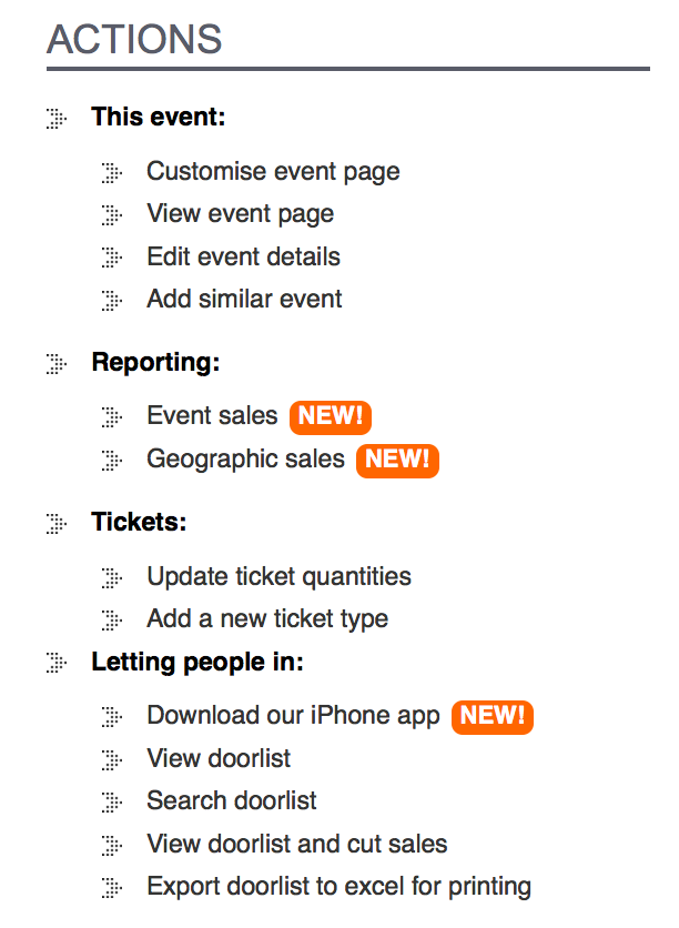
When viewing your event dashboard you will see some new items in the right column menu:
Clicking on Event sales will launch our brand new sales dashboard:
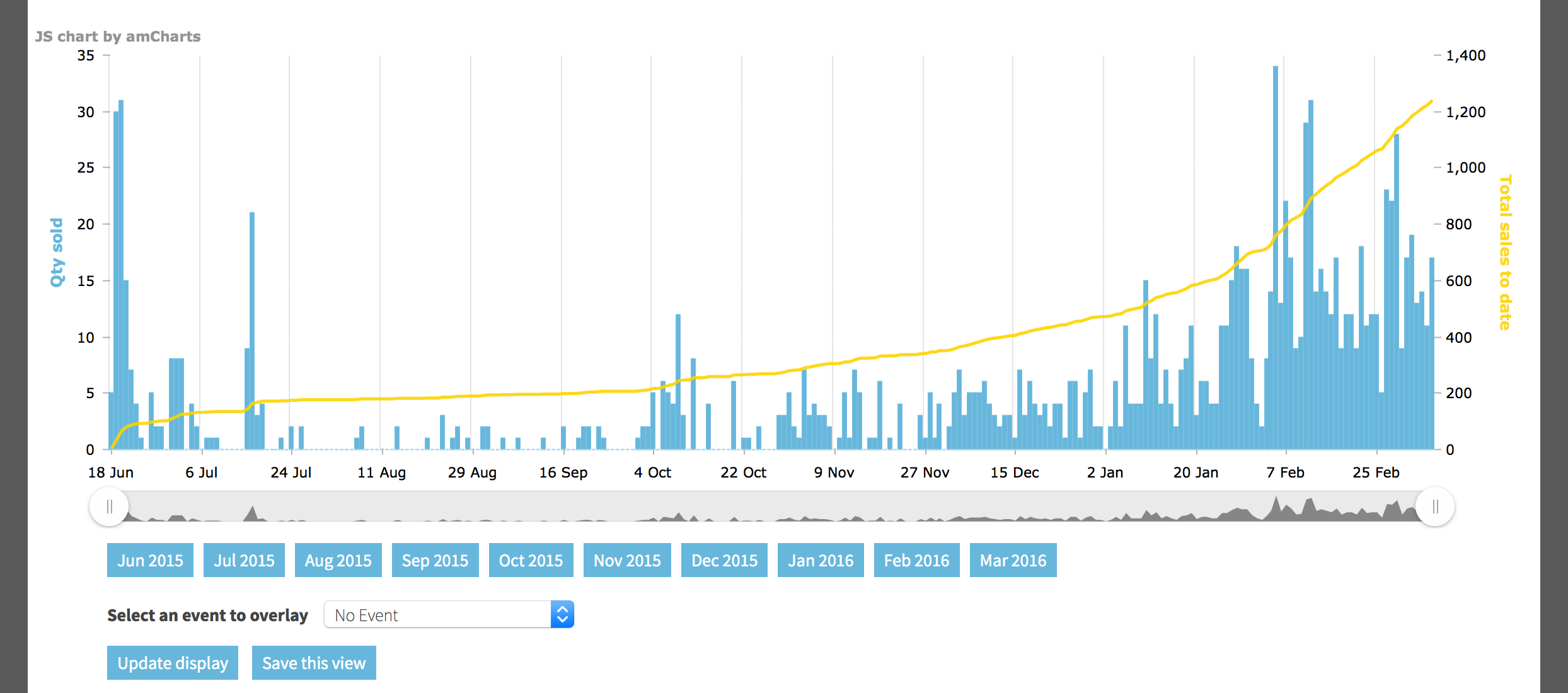
Here you can view daily sales for your event (the blue bars) as well as cumulative sales for the event (the yellow line). Whenever you hover over a point on the chart a tooltip will tell you the exact quantity and value of sales for that specific day.
You can zoom and scroll the chart to see any range that you're particularly interested in, or use the month selectors underneath to jump to one month in particular.
Words and pictures cannot express how much fun it is to play around with this chart. It's so reactive, so responsive, in the way that you can click, drag, zoom, hover, click ... interact with it in pretty much any way you can imagine.
Log in now to have a look for yourself
Want to know how your event is selling compared to previous events? Use the drop down to select another event to overlay, like so:
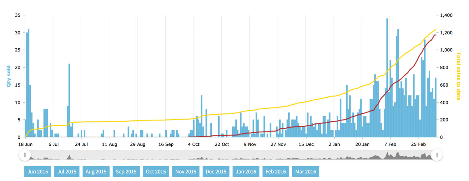
The red line which has been added to the chart is the cumulative sales for a previous event, chosen by you. Hovering over points on the chart will now show you the total number and value of sales for the current event as well as the previous one. Plus, we'll show you the % difference each day to save you from calculating it yourself.
Going back to the event dashboard, you can also click on Geographic sales which will launch a sales map showing you where people who are buying tickets for your event live:
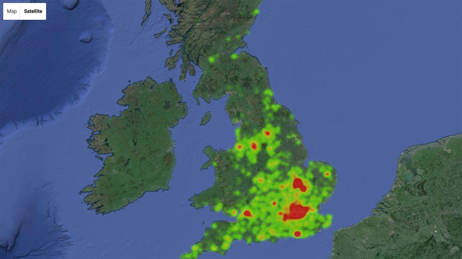
You can click and zoom/move around the map to find out where your event is most popular.
If you want to know exactly where your sales are coming from you can switch to markers view which clusters sales together on a map. So you can see that you get most of your sales from certain parts of the country, or even zoom into city level and see where your ticket buyers are based:
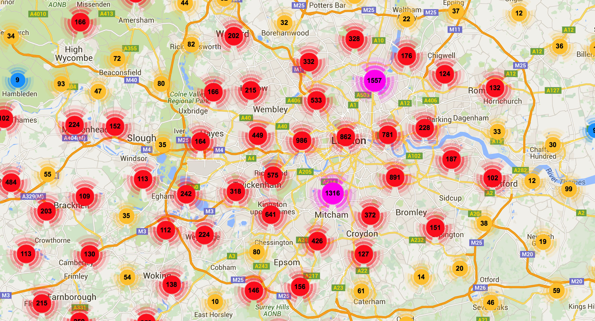
You can toggle between 3 ways of displaying the data on the map:
- Heatmap (as shown above)
- Markers (as above, sales are clustered together showing you how many sales you get in each portion of the map)
- By postcode (we overlay postcodes onto the map and you can see how many sales you've had from each postcode - ideal for fine tuning your marketing)
In short, we think that these tools help you see, at a glance, exactly how well your event is selling, how it compares to previous years, and where in the country your event is most popular. Armed with this information we know you'll make your events even more successful and enjoyable for all who attend.